The Annual Caramel Animals MBFWA Highlight Review 2019

Words and Photos: Reef Gaha Runway and Backstage at Resort ’20|

Caramel Animals presents a retrospective and alternative look at Australian Fashion Week, Resort ’20.

Now that the stardust has settled, we bring you this irreverent and non-comprehensive look back at ten Resort ‘20 collections, traversing news and interviews from backstage at seven shows, where we conversed with our favourite hair and makeup directors as they worked to embody designers’ visions in follicular and maquillant form. As usual, in our quest to decode the concept and inspiration behind each collection showcase, the creatives at the nexus of couture, hair and makeup often provide the richest, most eloquent source of insight.

You’ll see every look from the runways we’ve covered and bear witness to frenetic, candid moments backstage. This year, our reviews are presented alphabetically, rather than in order of appearance.

This year’s review covers Alice McCall, Carla Zampatti, Double Rainbouu, Emma Mulholland, Lee Matthews, Leo and Lin, Mariam Seddiq, PE Nation, Tigerlily and We Are Kindred. 


| Alice McCall |

Resort ’20 marked 15 years of Alice McCall’s eponymous label. The designer synonymous with playful rock chic, bohemian glamour and effortless vintage references sent the latest evolution of her signature style down the runway with the ‘Cosmia’ collection. McCall brought delicate fabrics of varying weight and transparency together, in pieces ranging from short play suits to two-piece sets and full-length gowns. Retro vintage prints gave way to mauve, fuschia, pink and coral. Layered ruffles were followed by meshy sheers and shimmering metallic gowns.

| Backstage at Alice McCall |

Backstage, we chatted with MAC Cosmetics Makeup Director, Nicole Thompson.
‘Today we’re doing 60s girl with a little rock and roll twist. It’s all about lashes today. We’ve actually got three sets going on; top, bottom, in between. We’re doing strips. We’re doing individual. We’re basically making it look so lashtastic, making their eyes look huge, but we’re fitting it to each girl. The lip is a beautiful nude; a dirty nude. It’s called Act Natural. I say a dirty nude, because it’s not peachy and cute. She’s not peachy and cute; she’s had too much of a good time. This is a couple of hours into the night kind of make-up.’

I ask Nicole for a little insight into who the Cosmia girl is.

‘I always feel like there’s a little bit of a 60s reference in Alice’s work. The last few times I’ve worked with her, there’s always like a little 60s thrown in. You know what? Today, we’re somewhere in between Twiggy and Jane Birkin. It’s that effortless beauty that Jane Birkin had, but then pack on those lashes and we’re heading more towards Twiggy.’

Wella hair director Keiren Street corroborates. ‘It’s all about a cool, kind of lived in, slight nod to the 60’s teddy girl. It’s a little bit sweaty, a little bit gritty. It’s a little bit of fun. Some of the girls have fringes plonked in there, to give them a kind of fun, effortless movement.’


| Carla Zampatti |

To say that Carla Zampatti is an icon of Australian fashion design would be an understatement.

Regardless, her enduring influence is as much a product of her everlasting flair for style, as it is her formidable acumen as a businessperson. In 2019, her signature look remains as contemporary and up-to-the-minute as ever. At Resort ’20, that signature was ever-present in a silhouette defined by strong shoulders, a taper at the waist and elongation of form to the ankles.

Clean lines abounded, with staples in warming indigo, a tiger lily print, suits and gowns in blacks and primaries followed by geometric and animal black and white patterns, culminating with the appearance of a balloon-sleeved number with narrow split skirting.

Zampatti was given pride of place in closing MBFWA. She chose to do so by bringing in the Brandenburg Orchestra for musical accompaniment, combining her love of classical music and fashion.

| Backstage at Carla Zampatti |

Backstage, we spoke with Lara Srokowski, Director of Artistry for Lancome Australia.

‘The makeup look for Carla Zampatti was all around architectural eyeliner, really pushing the boundaries of makeup. Really quite defined eyes.

Lancome is always about really natural skin, so we’re using that to compliment these quite structured eye looks. There’s been a lot of architectural eye liner this year at fashion week, which has been great to see, really. It’s my signature eye liner, so it’s great. I really love designing eye liner looks.’

The makeup look was also a statement on Zampatti’s signature style…

‘Definitely. This is a 60s and 70s inspired winged eyeliner. That was the trend back in the 60s and 70s, so it’s cool to kind of modernize the wing liner a little bit and to take it a little bit more edgy. We’ve made it triangular in the outer corner and done that splash of gold, for a more modern approach on that wing.’

We also spoke with Goldwell’s John Pulitano about the hair concept.

‘I feel like Carla’s work is so high end and beautiful. Today she has these beautiful pants suits, lots of prints. It’s definitely expensive, but what we want to do is bring a softer, freer element to the hair, more like a rock chick inspired look. That gives it a bit of toughness and a bit of an edge. The whole idea is to keep it flat and more head-hugging, no volume at the roots, because the more volume, the more beautiful a look becomes. Spray your double boost on the roots. Blow dry flat. Blow dry the deep side part over the face, because we want hair covering one eye when the girl comes out. Blow dry that all forward, and then we are going to take a round brush, and we are just going to put a little flick in it, but all we want is a bend. We don’t want to make it retro. How do we take a ’70s inspired flick and make it now? We put a little bend in it, so when girls come out they might have a little right angle, and then the hair will just billow out to the side, and that will reference a nice ’70s inspiration brought into the now.’


| Double Rainbouu |

This year, Double Rainbow’s off-site collection showcase took place in the Chinese Garden of Friendship alongside Sydney’s Darling Harbour.  Designers Mikey Nolan and Toby Jones chose the gardens for the way they ‘present an idealised microcosm of nature where all elements are balanced in harmony […] The garden is a moment of peace and tranquillity within the concrete and chaos of the city’. The ‘Synthetic Leisure’ theme, emblematic of last year’s collection has given way to a zen-like embrace of nature. The fabrics are softer and feature ‘gi’ style two piece sets, some carrying Japanese style prints harking to ‘The Great Wave off Kanagawa’. Macramé towel carriers and slide footwear speak to long summer vacation days, but Double Rainbouu’s psychedelic and Nu-Rave influences are still evident; These garments will be as much at home on warehouse party dance-floors as they will be on the beach.


| Emma Mulholland |

Emma Mulholland’s ‘Holiday’ breakout label has been characterised by collaborations with artists and photographers, and by Emma’s interest in the souvenir. We asked Emma herself for a little insight. ‘I’ve been working at Paramount Hotel on a collaboration. I wanted this event to be just a lot of souvenirs. I’ve worked on about 8 different collaborations with Sydney artists. And yeah, we’re just kind of having a party and there will be a bunch of people dressed up in the clothes and stuff as well.’ For her Resort ’20 event, Emma decked out the foyer of Paramount House Hotel as a pop-up Souvenir shop – the kind you might find at a regional holiday destination – and put on a party. Soft toys, homewares, totes, t-shirts, caps and hoodies filled a space decorated with palm trees, neon lights, wax fruits, and Mulholland’s key checkerboard thematic. Models and various guests at the party wore pieces from the Holiday collection, resplendent in those checks, pastel pinks, bright greens and logo prints.


| Lee Matthews |

Matthews celebrated 20 years of her label this year, and for part of this collection, drew on influences from her earlier work. Sheer fabrics, draping, utilitarian sensibilities and an ‘LM’ monogram print all made an appearance as Lee along with head designer Natalia Grzybowksi hewed from the elegant yet utilitarian sensibility the house has become known for. Separates in sustainably sourced linen and cotton met statement dresses in luxurious silks. A palate of black and white was punctuated by dark reds and soft pinks, all set to a soundtrack that concluded with a Cocteau Twins finale.

| Backstage at Lee Matthews |

Backstage, we spoke with Nathan Gorman, Hair Director from Kevin Murphy, about what inspired the hair look. ‘Lee Matthews has a really effortless appeal, and we wanted to actually fold the hair in a way that didn’t resemble a bun, but was unique and reflective of the folds in the clothing that Lee actually does. So, Lee’s quite famous for using lots of different kinds of fabrics and draping to create that beautiful shape and flow. We wanted to highlight and actually make the hair disappear. So we folded it, we tied it, and we’ve used a hairband around the face to elongate the neck and to really hero the face and the neck, and the shoulders of the clothing.’

Claire Thompson directed the makeup design. ‘There’s always a freshness to the Lee Matthews woman. She’s never overdone, never tacky. In a time of contour and wet highlights, I feel the Lee woman is an in-between. It’s not matte skin, but it’s not wet or glossy. It’s a creaminess now to the skin that we’re seeing, which I think is a lot more elevated; more expensive looking.’

Claire continues.

‘She’s travelled, and there’s a little flush on the cheeks to tie in with those beautiful fabrics that indicate travel, and that indicate you’ve been having a good time. Beautiful brushed-up brows. She’s elegant.’


| Leo and Lin |

Leo and Lin’s sophomore outing at MBFWA made a marked departure from the sweet ‘Ms Moonlight’ collection that debuted last year. Romance was still writ large, but this time the creative vision expanded into an eclectic toughness and worldly versatility, evidenced by the adoption of botanical prints, revealing sheer and mesh fabrics, and a nomadic, gypsy-like flourish to the styling. This, with a touch of the Asiatic, and even the frontier. Flowing printed silks and scarves met with structured lace gowns, tailored separates and even a see-through rubber half mac, while brocaded black lace spoke of a darker European sensibility. Leo’s collection has stepped off the silver screen, donned its travelling boots and taken to the four corners of the globe.

| Backstage at Leo and Lin |

Backstage, we spoke with Jo Smith, an Artistic Director for Toni & Guy Australia, and salon owner for Toni & Guy Georges, in Melbourne. ‘We’re working with clothes that are elegant, strong, and romantic. So that’s what we wanted to bring out in the hair. We’ve got three hair looks that we’re working with. Our first look is a soft wave, something that’s got a nice stressed feel to it, but looks effortless. Second, we’re working with a low ponytail that’s going to be a textured, dishevelled knot but again, working with a very soft outline, so you get that romantic feel coming through.’

‘Our third look is going to be more of a slick, lived-in and slightly grungier, but still a very beautiful, elegant feel. Working with a soft wave and working its structure and definition around the face.’

‘With the mood board, something that was very apparent were romantic, wispy, soft references. But something that still had a very strong structured feel to it, which I think is going to complement the Imperial collection so beautifully.’

Kelly Bowman was Makeup Director, with sponsorship from Natio. ‘I’m keeping all about the skin. It’s going to be pretty, femme, nice and dewy, and luminous. It’s going to be a soft focus on the eye. We want to really extend everyone’s eyes, but really softly. So we’re using really warm, natural tones. Earthy tones. The brands’ quite femme and soft, so we’re trying to keep it that.’


| Mariam Seddiq |

Mariam sent her Resort ’20 collection down the runway to the remixed strains of Metallica’s ‘Enter Sandman’. The attitude conveyed was one of power chords, rock chic and glam. Silver and gold metallic fabrics met smooth tailoring, with the volume turned up to eleven. The styling harked to 80’s hard rock videos and a Motley Crue sensibility, but none more than the sheer black dress and blazer look, shown third in the order.

| Backstage at Mariam Seddiq |

Backstage, we spoke with Lara Srokowski of Lancome, who directed makeup for the show.

‘Today’s makeup look is all about empowering women, so we really wanted to empower the woman with their skin, and keep it really natural. Mariam Seddiq is all about women and empowerment, so we thought it was a perfect partnership with Lancome because that’s our mission as well. Then we’ve gone for quite an edgy twist of the eyes, to match the intensity and patterns and fun of the outfits. So we have that really structured, almost graphic eye; an architectural eyeliner really helps to add that pop to it.’

Diane Georgievski directed hair for Redken.

‘Today, the hair is based on that Parisian woman, that really lived in hair, beautiful texture, to really accentuate unbelievable gowns that are walking down the runway today. We want the hair to look effortless, but in fact it’s very structured. This is a complicated woman, but she wants to feel and look like she isn’t, and the hair needs to emulate that. Three days, four days strolling around, just absolutely sexy.’
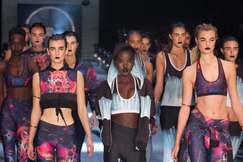
 

| P.E Nation |

Resort ’20 marked P.E Nation’s first solo runway show, but the buzz surrounding the ath-leisurewear brand established by Pip Edwards and Claire Tregoning has been bubbling up at ground level with a momentum spurred on by how readily women have been adopting this label; taking it to their hearts and wardrobes. This is street and sportswear equally adaptable to action or lounging, with a graphic presence and attitude that has seen it equally ratified by nightlife and subculture. Makeshift stadium bleachers were set up to seat audience members at the show, and the finale showcased a swimwear collaboration with Speedo which saw models walk out to bathe in an ‘aquatechnic’ indoor waterfall.

| Backstage at PE Nation |

Backstage, Carol Mackie, global artist for MAC Cosmetics took charge of makeup. We asked her about the concept. ‘So it’s really quite organic. Not really a contrived makeup, if you like. It’s organic in that we’re using product that is really a ‘staining’, so staining on the eyes, staining on the lips. Quite monochromatic in that we’re using rusty tones, earthy tones. But then what we’re doing is adding a touch of what you might call armour if you like. It builds strength in the inner corner [of the eye] with that little fleck of gold.’

Carol continues. ‘When you think about P.E. Nation, and the way they are, it’s quite a strong brand, but it’s still beautiful, and organic.’

Brad Mullins directed hair for Original Mineral. ‘I’m so inspired by the girls. I wanted to use cool girl texture, so I wanted diversity; wanted individuality with the girls. We’re going with a styling feel with a middle part, keeping it flat to the scalp, and some of the hair we’ll braid underneath, using our products in a creative way. We’ve created a bit of a wet look for the top, and the ends are going to be dry and very textured It’s just a kind of cool girl hair, which will echo the clothes.’


| Tigerlily |

This collection marked Tigerlily’s return to MBFWA after a 17-year hiatus. With the runway wet down with water, and tropical sounds filling the gallery, one could have been forgiven for thinking Tigerlily were about to send a swimwear show down the catwalk. Instead, the audience was met with a full collection of day to evening wear.  Tailoring featured, as did linen, sleek pant suits, ruffled skirts and subtle tropical detailing such as coconut buttons and minimalist white lily bouquets. Wardrobe staples in suede appeared alongside versatile layered dresses, all with an easy summer sensibility, true to the label’s core.


| Backstage at Tigerlily |

Backstage, we spoke with Lancome’s Lara Srokowski about the makeup look.

‘We’ve used our iconic Advanced Genifique Serum. We’ve actually layered an oil on top, to really amplify the glow on the skin, and then we’ve mixed the oil into the foundation as well, which manipulates the texture. Makes it a little bit more lightweight and glowing. I think the look here is effortless and beautiful. That glow really helps to compliment this collection, and I mean, when I was looking at the collection I could just imagine them wearing all these clothes on a beautiful summer holiday, so you know that skin is super important to compliment the collection.’

Lara hints at the ‘surprise’ Tigerlily were about to deliver to anyone expecting a swimwear collection.

‘Really beautiful linens and just such a beautiful collection. A bit different for Tigerlily, they were mentioning; there’s a lot of linen and quite simple, elegant clothes, so really beautiful.’

We chatted with John Pulitano, Hair Director with Goldwell, about the hair look for the show.

‘The inspiration for the look today was an ode to the ’40s and ’50s screen sirens, Lauren Bacall in particular. What we liked about what was that beautiful front wave that they used to have. Obviously we need to transport that into now, so we decided to go for a wet look as well, because we want to create that slightly tougher, sort of edgier girl.’

Less of a hairspray look?

‘Less of a hairspray look. Less of a beautiful look as well. We want to cut to the beauty, by using wet hair. We used a Double Boost, which is a spray volumizer onto the roots. Then we used the Curly Twist Surf Oil and dried that in. We used a little bit of wax on the roots, then we went through again and sprayed more Surf Oil in. Now we’re just putting some pins in, trying to keep them fairly high up near the crown area. Then we’ll just wet down the ends and just give it a bit of sheen before the girls walk out.’

John has recently made the shift to working with Goldwell, after being one of Redken’s mainstay Hair Directors for an age. In many ways, the change marks a new era in hair direction at Australian Fashion Week. We ask John about the move.

You were with Redken for how many years?

‘About 10.’

That’s a long time. Can we talk about that?

‘Yeah. Look, I just wanted a change. Ten years down the track, I felt like it was time… There’s so much product technology out there, I needed to have more. I’ve got a lot more now, in terms of Goldwell, and a lot of other [partner companies KMS and Kao] ranges as well.

A lot of new companies are coming into Fashion Week, sponsoring and doing hair at for the shows, where Redken was dominant for a very long time.

‘Yeah, Redken definitely were at the forefront of Fashion Week. I think these days, for a lot of companies, in terms of sponsorship dollars, they don’t always have the budgets they used to have years ago.’


| We Are Kindred |

Kindred returned to MBFWA with a new colour palette and a nomadic, bohemian look. Last year’s emphasis on florals, pinks and pastels had given way to subtler bespoke botanicals, and soft paisley prints. Black, white and gold were a feature, but the undoubted hero was a gorgeous bel air blue. Ever present were linen, cotton and silk in separates, dresses, and playsuits.

And that’s all she wrote.

The index finger that pressed the shutter button has triggered its last full-burst capture (and having written this article, moves on).

MBFWA is over for another year, leaving us all to ponder the mercurial, intersectional flashpoint between art and fashion, as we reflect on how we as Australians choose to adorn ourselves as an earthbound species in 2019/20.

Dust off your glad rags for another season and as you do, give a moments’ thought to exactly where the boundless talent and energy behind Australian fashion might take us this time next year.

Reef Gaha is an Australian photographer.

MBFWA is managed by IMG. Mercedes Benz is the naming rights sponsor.

See more at http://mbfashionweek.com

The Annual Caramel Animals MBFWA Highlight Review 2018

Words and Photos: Reef Gaha | Editorial Assistant: Camilla Turnbull | Runway and Backstage at Resort ’19|

Caramel Animals presents a retrospective and alternative look at Australian Fashion Week, Resort ’19.

Now that the glitter has settled (or was it stardust?) we bring you this irreverent and non-comprehensive look back at eleven Resort ‘19 collections, traversing news and interviews from backstage at eight shows, where we conversed with our favourite hair and makeup directors as they worked to embody designers’ visions in follicular and maquillant form. In our quest to decode the concept and inspiration behind each collection showcase, the creatives at the nexus of couture, hair and makeup often provide the richest, most eloquent source of insight.

You’ll see every look from the runways we’ve covered and bear witness to frenetic, candid moments backstage, culminating in a spectacular denouement as Camilla confers an utterly transcendent, heart-rending finale to the week.

This year’s review covers Alice McCall, Albus Lumen, Lee Mathews, Double Rainbouu, We Are Kindred, Hansen & Gretel, Romance Was Born, Deadly Ponies, Roopa, Leo & Lin and Camilla. 

| Alice McCall |

McCall playfully brought delicate fabrics of varying weight and transparency together, in pieces ranging from play suits to two-piece sets and full-length gowns. Fuscia, florals, geometric neutrals and minty aquamarine pastels met cascading pleats in lavender and pink flanked by black, gold and white pieces. Evident as ever were McCall’s delicate hand embroidered flourishes and custom in-house designed laces. Feminine to the core, McCall’s look is one where a quintessential rock chic and underlying toughness temper the diaphanous fabrics.

Backstage, we chatted with MAC Makeup Director Nicole Thompson.

‘So, with Alice’s collection, like most of her collections, the dresses are for real women and how they want to look; very feminine, very girly, really beautiful. So, we always like to juxtapose a little with the makeup and hair and have a bit of toughness so it doesn’t look too floaty and girly. This year, it’s a little ‘twisted fifties’.

 Nicole continues.

‘The feeling of the hair is a modern take on the victory roll. The hair is twisted up backwards. I wanted to have the liner really powerful and strong. When they’re walking straight ahead, we wanted to make sure these [liner] flicks can be seen from both sides of the catwalk, super intense. The key with this was to get the girls looking straight ahead, and we did the flick-in first. That way, on the profile it’s super strong when they’re walking by. They look like they go faster with this liner – this liner goes faster!’

 Renya Xydis, hair director for Wella Global confirms the concept.

‘It’s vintage, forties/fifties tough chic, so she’s the cool Alice McCall girl. Basically we’ve just pulled the hair back on both sides so you can see the cheekbones and their fierceness. We’ve made them look fierce but not hard. We’ve made them look beautiful but not too pretty, and we’ve made them look strong but still feminine. Yeah, tough chicks.’


| Albus Lumen |

Marina Afonina’s inspiration for this collection was Pablo Picasso’s terracotta ceramic work from the 1970s. This is evident in the colour palette and fabrics seen at Albus Lumen’s first on-site MBFWA show. Deep, earthy tones met burnished ochres, soft blues and deep emeralds. Minimalist ¾ and ankle-length silk pieces were joined by two-piece sets with rustic undertones, many adorned with feature buttons and subtly styled contours. Tie waists, head scarfs and bucket hats complemented a look evocative of a provincial Mediterranean summer.

Backstage, we spoke with Lara Srokowski, makeup director for Lancome Australia.

‘The makeup look is about strong and powerful women, but it’s quite a unisex look so it’s really all about the skin. It’s perfect for Lancome because that’s our signature technique. What we’ve done is half the models will have this really beautiful natural glowing skin, which represents femininity. Then, you’ll see more of a masculine look as well, which is more of a terracotta touch to the skin. You’ll notice some of the models have a slight terracotta, almost sunburnt look across the high points of the cheek bones and the nose. This is to represent that they’ve been there working with clay. The ladies have been sitting there making pots, so they’ve had a little bit of clay kind of splashed on the face.’

Travis Balcke, hair director with Balmain Hair Couture further expanded upon the terracotta theme.

‘So Marina’s vision for the show is Pablo Picasso, and that there are two types of people in the show. There’s more of a masculine and a feminine but we’ve left that up to the person watching the show to decide which look they feel is more masculine or feminine. We have some girls with their natural texture, which we’ve encouraged with leave in conditioner, and then the second look is a more traditional ‘Spanish’, where we extended the hair and worked with high-sheen gel to create a long, thin braid.’

I asked Travis about his work with Marina.

‘We went to Los Angeles and shot a campaign which kind of set the tone of the collection, then came back and had several meetings about the girl and who the character of the show is. So, it’s quite minimal, but a lot of thought went into creating that.’


| Lee Mathews |

A passage from Lee Mathews’ site summarises this collection best.

‘Initial inspiration for the Lee Mathews Resort 19 collection came from the iconic American architect Frank Lloyd-Wright, designers Charles & Ray Eames, and minimalist artist Donald Judd [and] their belief that design should be in harmony with humanity and the environment.

With this concept in mind, Creative Director Lee and newly appointed Head Designer Natalia Grzybowski began with a grounding palette of creams and clays, punctuated with pops of mint, orange and blue. These colours appear across a hybrid of natural textiles and zero-waste fabrics – from organic cottons to a coated zero-waste Italian linen and ethically sourced silks […] Collectively, these precise compositions represent the vision and hope of change in the fashion industry, one where the environment is no longer an absent factor in the manufacturing process.’

Backstage we spoke with Alan White, Hair Director for Di Lorenzo and Lee Mathews, who confirmed the ecological sensibility behind the show. ‘Basically both companies come from sustainable backgrounds, and it’s a perfect tie up between the two companies. Di Lorenzo being ethically sound, and all of their ingredients being biodegradable, natural, and the same with Lee. Lee’s doing a lot of work with ethically sourced clothing, bottles, bottle tops and recycled stuff. We’re in an era now where it’s coming to pass, that’s what’s happening. We’re all trying to help save the planet.’

I asked Alan how this concept is further embodied in the hair look. He’s enthusiastic.

‘What we’re doing is organic, so we’re just trying to get every girl the best out of their hair. We’re using two different elements of the Di Lorenzo range. One is a conditioning, beautifying range, so […] that’ll finish them beautifully on the ends. And if we need to do a little setting, what I’ve done is use super single quill clip-ins around the forehead to open up the face. I’ve either used Barrel Wave, C-Swirl or Motion Mousse and then using the super single clip-ins, clip them into place and then diffused it dry, and what that does, it leaves me an indentation. After it’s all finished, we just brush it, run our hands through it, create a low ponytail at the nape and then finish it with the Ocean Mist. Just putting that on your hands, it relaxes the hair, brings in a little bit more natural texture.’ Alan sums up his working relationship with Lee: ‘I knew Lee when she was making clothes out of a bedroom in Paddington probably 25 years ago. So we’ve known each other since then, and I think she knows my feel is a really natural feel. So, natural texture.’

Claire Thompson, makeup director with Guerlain, expands upon the concept.

‘I believe in the skin. Less about powder and baking and highlighting and contouring, and more about creating a glow from within. Super, super moisturised skin. Using this incredible colour on the lips, but also on the cheeks and across the bridge of the nose, and all the areas the sun would naturally hit. I feel it gives us a more lived-in bronze, summer glow in a way because it’s less towards those traditional bronzy colours and more about this sort of lift lately, like you’ve had a little too much sun. And the lipstick too. Not perfect. No heavy lines. Everything is sort of blended out. Everything is slightly imperfect to make it look perfect.’


| Double Rainbouu |

As former creative directors at Ksubi, Double Rainbouu’s Mikey Nolan and Toby Jones are exponents of an erstwhile cult-like subcultural tradition within Australian fashion. There are times when clothing forms part of an inextricable intersection between emerging culture, music and nightlife milieus. Post-lockout Sydney is not exactly in the grip of a compelling subcultural emergence, but this collection, appropriately presented at the Lansdowne Hotel, harks to such pivotal moments in youth culture.

‘Synth UUave Resort 19’ speaks to a psychedelic synth-wave inspiration behind this collection, evidenced by the ‘Synthetic Leisure’ motif woven into key pieces. The colour palette is pure candy shop and neon, tempered with darker industrial fabrics and warped checker-boards alongside fetishistic fish-netting and PVC, primed for a mind-altering all-night rave.


| We Are Kindred |

An endlessly feminine tour de force, this was one of those shows where every girl on the runway embodied a leading lady presence. Floral and botanical prints, a runway lined with fresh floristry and hemlines adorned with daisy flower appliques; a colour palate of pink, minty green and creamy white ensemble pieces with gorgeous detailing, all perfectly accessorised with custom sun hats, matching scarfs and gold statement jewellery.

Backstage, we spoke with Richard Kavanagh, hair director for Redken, about the hair look.

‘We’re creating a really very feminine style with a utilitarian braid and a gritty texture. The concept for the show is about the strength of femininity, bringing the gritty texture in. It’s as though she’s busy working, she’s just thrown her hair back in a quick braid, and she’s getting on with her work.’

I asked Richard about working with Kindred.

‘I’ve worked with the Kindred brand on a regular basis since they started. I guess my personal aesthetic matches their brand aesthetic, so it’s super easy. I just turn up and go ‘here you go, do this’. It’s a really easy creative process. I get what they’re trying to say with the collection, I get what they’re trying to say with the brand. So I just try to enhance and amplify that through creating a character with the hair. I guess the We Are Kindred woman is a woman who is powerfully entrenched in her femininity. She embraces her femininity and is strong in it.’

Makeup director Molly Warkentin gave us an insight into the makeup look.

‘It’s all about being fresh, youthful, free spirited. I’ve taken that into the skin; it’s all about skin.

We want them to look really hydrated, but I wanted to play and make it fun as well! To make that freshness come through, we’ve used blush for a flush through the centre panel of the cheek, almost like she’s just run up some stairs. And then we’ve done some faux freckles as well, which just keeps it fun.’

I asked Molly about the faux freckles.

‘We were shooting their campaign and I kind of just did my thing in the morning. We loved it, and that was going to be the makeup. The model we were working on, Zoe Barnard, actually had natural freckles, but I loved it so much, we decided to do the faux freckles for everyone. She was my inspiration, my freckle-ation.’


| Hansen & Gretel |

Hansen & Gretel’s rocking ‘Eve’ collection stood out for the way it seemed to riff on that evolutionary moment in the late 70s where premonitory foreshadowing of 1980s styling had very much begun, but elements of the late 60s influence were still an integral part of the visual currency. This moment spanned styles from mild to wild. At times H&G seemed to be calling on the gloss of Charlie’s Angels (complete with a buoyant hair flick) and at times, the grit of Stevie Nicks. This along with a wealth of other 70s pop-culture iconography and a huge helping of Rock ‘n’ Roll, with a catwalk move that saw a ‘Satisfaction’ T-shirt walked halfway down the runway before dodging left into the crowd without reaching the end – cute. Many looks saw the models shod in the ankle boots which have resulted from H&G’s collab with Senso, sporting deep forefoot lacing almost to the toe, mildly reminiscent of a daintier ice-skate style boot.

Backstage, we caught up with Prema’s inimitable Gareth Lenagh, hair director for KMS.

‘The look that we’re going for is an evolution change. Ainsley really wanted to emphasise the natural progression of women. We’ve started off the hair with a natural look, working with the girls’ natural texture. We wanted to make them the best version of themselves. We’ve taken a centre part, working it with a really polite ear tuck, and some natural movement through the back, then we’ve worked that into a low ponytail. With that low pony, we’ve used a little bit of rope. The reason we wanted to use rope? It’s a little more raw. With the theme of Eve and the Garden of Eden, I wanted to bring in a little raw material. That’s working all the way through to the end with what we call the grunge curl, which is more styled; it’s more of a finished look and a pop.’

Rene Benkenstein directed makeup for Clinique. We asked her about ‘Eve’ as she worked on Clinique ambassador Steph Claire Smith’s fresh visage.

‘This is very feminine; this is exploring different levels of femininity. Its free, it’s still very beautiful, but not overly done.’

Rene continues. ‘Different looks play up different elements, but always making sure that it’s not overdone. So, when it came to cheeks for example, there is more of a soft flush. Lips would be natural lip toned, but just enhanced a little. And then on the eyes we have some natural moments, but also a slight graphic liner. And then some of the models show a surprise pop of blue. So, that also brings in a little fun element.’


| Romance Was Born |

After closing MBFWA with the spectacular ‘Electro Orchid’ last year, 2018 saw RWB take their show off-site and ‘underground’, into the speakeasy cabaret-like surroundings of Restaurant Hubert in Sydney’s CBD. Sequestered away below street level, their latest collection was revealed. Though still glowing with the colour palette and ethereal themes that herald their signature style, the shift to a Tuesday night in a cosy venue seemed to reflect the more approachable wearability with which Anna and Luke have imbued ‘Mother of Opal/Opal Goddess’. Incorporating Jenny Kee’s classic opal print and referencing Erté’s iconic art deco illustrations, the pair have put a modernised and uniquely Australian twist on high 20’s style. Models walked the collection out into static, mannered poses while draped in vibrant colour, luxurious jewels, abundant pleats and soft, flowing materials.


| Deadly Ponies |

An NZ label making their MBFWA debut, Deadly Ponies are known for their leather accessories. The newest line ‘Devotees’ takes inspiration from devotion. Creative director Liam Bowden is quoted in FashioNZ as saying ‘In the new season silhouettes, PVC features heavily as a means of presenting a second skin over signature pieces, protecting and revering the objects within, creating almost transportable temples of modern day craftsmanship.’ For the show, models were clad in soft, flowing pink and violet outfits fashioned from scarf material (and previewing the brands forthcoming scarf collection),  to walk bags out, with electric blue and pale pink pants serving to highlight and maintain focus on the accessories being presented.


| Roopa |

Perhaps John Pulitano, hair director of this show for Redken summarises Roopa’s Resort ’19 collection best: ‘When I spoke to Roopa, the concept was all about the architecture in Nepal. Really beautiful, colourful, different mandalas hanging in the street. Beautiful textures; the rooftops and the layering in the rooftops. I think a lot of her shapes are very much like that too. Lots of beading. There’s definitely a real richness in the colour of the fabrics and the beading. It’s a really beautiful collection.’


I asked John how he’d be reflecting this theme with the hair.

‘One look is a little reminiscent of how the women in Nepal would wear their hair; generally it’s very smooth. It has a rich texture. A very soft braid, but literally just the beginning of a braid. The first twist, and then we’ll tie it so that there’s some pieces coming through, very soft and very luscious.

Then we’ve got girls with curls. With them, we’re going to create a really defined, beautiful, separated curl and lots of high shine. I really want to make that curl come to life on the runway, but instead of coming to life in a fluffy kind of way, coming to life with a really moist finish and shine.’ As we spoke as John worked on the tresses of Redken ambassador Adriana Perri, who’d stopped by with the Blondage Army.

Makeup director Lara Srokowski from Lancome corroborated, and explained the makeup concept.

‘The clothes are really pretty for this particular look, so we wanted to have the makeup a little grungier to complement the style so as not to be too overpowering with that kind of prettiness. We’ve created a beautiful skin, that’s our signature, and we’ve gone for a little more of a grungy eye look. You’ll see a trend of two different eye looks throughout the show. There’s one that will be dark black liner, smudged all over the eye with black eye shadow on top. Then, just before the models hit the runway we’re going to make it nice and glossy and it’ll start to smudge a little bit. That’ll look cool. The brows are kept raw so the focus really is that eye. The second eye look is all about liner; the inner rim has been lined, and then on top there’s a little bit of a winged liner, but it’s been blended into the bottom, so it’s kind of an architectural eyeliner look.’

I asked Lara what she’d use to give the eye work its glossy look.

‘We use lip gloss. I’m using one with a bit of glitter in it so it gives that two-dimensional gloss effect!’

| Leo & Lin |

Leo & Lin carried off their MBFWA debut with an ethereal theme, a galactic muse and a starry violet backdrop. The ‘Ms Moonlight’ collection was unapologetically whimsical. Shades of sunset, dusk and pale indigo were evident in a colour palette that contrasted with a glistening, celestial white. The starry motif, astrological symbols and cute sixties styling were evocative of golden age cinematic musicals, with a contemporary geometric twist. To that end, Moon River featured prominently in the soundtrack, calling Audrey to mind.

Rajja Richani directed the makeup for Napoleon Perdis. We asked her about the look.

‘Really ethereal, beautiful, clean, fresh and hydrated skin with very minimal makeup actually. We wanted the girls’ beauty to shine through.

We have an accent of white and silver glitter underneath the lower lash line, so it’s very intergalactic; very ethereal and otherworldly. Then we have a holographic silver star placed on the cheek bone to accent the stars throughout the collection. Overall though, just a really clean, ethereal, fresh look. Skin is the hero.’

Nadia Semanic directed hair for Tony and Guy. We asked her about the hair concept.

‘We wanted to go with something that was sixties inspired, but not too much. So today we’ve modernised that concept by using what is quite prevalent today, the top knot, but instead the knot is at the base of the neck.

So a really low, tight knot at the base of the neckline. We twisted the hair and created a knot, pinning it around the edges. In terms of the parting for the models, we used a really sharp central parting or a really dramatic side parting, just to differentiate and keep it really individual. We wanted it to be uniform but also wanted to keep the individuality. What we’ve also gone with, is we’ve kept the models natural texture when placing it into the knot, so the hair had that cohesiveness but still kept that individuality.’


| Camilla |

And so we come to MBFWAs stirring, transcendent finale. Camilla Franks showcased her newest collection, ‘ The Girl I Was, The Woman I Am.’

Carriageworks’ largest gallery was transformed into a sensuous Japanese spring evening, resplendent with an 1100kg prop cherry blossom tree. The ground was carpeted with several hundred thousand cherry blossoms, as the walls were draped from floor to ceiling in bolts of fabric bearing Japanese fan-like motifs. The renowned Satsuki Odamura Koto Ensemble provided live musical accompaniment to the runway, replete with huge Taiko drums.

Goldwell’s press release provides insight into the collection as ‘Inspired by Camilla’s travels to Japan’ and quotes Camilla. ‘In Japan, both the girl and woman unravelled and played in the juxtaposition of the ancient and the modern. The mysterious and erotic. The playful and exotic. I wrapped myself in ancestral kimonos and ceremonial dressing that light the way for girls to find their womanhood and the infinite possibilities that lay in this realm.’ During the show, girls of all ages walked the runway, speaking to all stages of womanhood and 90’s supermodel next door Emma Balfour graced the set.

We spoke with Alan White for Goldwell regarding the hair direction for the show.

‘Well there’s an influence from modern Japan with some history thrown in. The girl is a traveller, she’s worked her way from Kyoto, to Tokyo, to Osaka and she’s starting to feel confident. She’s a girl, now she’s turning into a woman. We worked with the traveller theme and Japan’s rich history of Samurai, Geisha and Harajuku girls to create hair that pays homage to Japan’s traditions, culture and colours, while making it modern and wearable. We included paper origami style ties around some of the caught pony to represent peace hair – a peace hair pony tuck.’

Linda Jefferyes directed the makeup for Camilla using Shiseido.

‘It’s a very Japanese influence, and so I really wanted to work with the idea of Japanese warriors. This is why I’ve used the mask-style glitter. I wanted to come back to Camilla as well – so that’s why I like the idea of using glitter, because Camilla always seems to use flourishes of sparkle and embellishment on her clothes. I wanted to keep the look simple but strong, and that’s why I went with the glitter.

We sent Steph from Shiseido to a shop to find something silvery, and she came back with these [adhesive glitter appliques]. I always had it in my head when I was referencing things about the Japanese warriors, I sent a lot of references through to Camilla. I was thinking, maybe I could paint that on?

The skin was a big part of the look as well. We wanted beautiful girls with fresh skin, which is why we’ve done the whole Shiseido cleansing and moisturising, and the beautiful, natural makeup they do. And then we’ve embellished with the warrior woman. As you can hear, the drums are beginning!’

And that’s all she wrote.

The index finger that pressed the shutter button has #triggered its last full-burst capture (and having written this article, moves on).

MBFWA is over for another year, leaving us all to ponder the mercurial, intersectional flashpoint between art and fashion, as we reflect on how we as Australians choose to adorn ourselves as an earthbound species in 2018/19.

Dust off your glad rags for another season and as you do, give a moments’ thought to exactly where the boundless talent and energy behind Australian fashion might take us this time next year.

Reef Gaha is an Australian photographer.

MBFWA is managed by IMG. Mercedes Benz is the naming rights sponsor.

See more at http://mbfashionweek.com


A Clockwork Melange

Why You Would | A Brief History of Mechanical Timepieces

Words and Photos: Reef Gaha |
Model: Yuka Suzuki |

A History of Mechanical Watches and Review of Five Current Examples |

IMG_1008

Caramel Animals presents; the mechanical wristwatch. For years supplanted by its battery powered counterparts then relegated to further obscurity by cell phones, at one stage its complete disappearance seemed imminent.
We’ve put together five attainable examples imbued with horological significance, for even the most budget conscious wearer. Some are faithful homages to rare classics. Others are obtainable classics themselves.

First though, a brief history of wearable clockwork.

Swiss watchmaking flourished through WWI and II under the cover of military neutrality. As American, German and Japanese clockwork factories were re-tooled to produce munitions, Switzerland maintained the techniques and facilities required to keep timepieces in production. This included the accurate chronometers and water resistance required to keep the war effort synchronised. Some of the most coveted pieces available today are descendants of (or homages to) the ‘tool’ watches used in conflict. As WWII ended, the Swiss once again emerged as the world’s horological chieftain.

This dominance continued largely unchallenged til the late 1960’s, when things began to change. Hitherto not-so-haute horologists in the USA and Japan were beginning to produce the battery powered watches that would precipitate the infamous ‘quartz crisis’.

The world flocked to more affordable and accurate electronic time-pieces. Where manual or automatically wound watches from Switzerland were once the apex of reliable time-keeping, their production was intricate and labour intensive. Economies of scale shrank as market share receded. The quartz invaders were unerringly precise. Where even chronometer certified mechanical pieces may lose or gain a few seconds per day, a little quartz cheapie will vary in the order of mere seconds per month. The Swiss watchmaking industry saw a decline in popularity. A new pop-culture icon was about to emerge in the form of the digital wristwatch.

Advancing circuit-board technology saw simple analogue models joined by increasingly complex digitised models. Calculator, databank and programmable pieces offered complications that mechanical clockwork couldn’t match. It wasn’t until a group of industrialists got together in the early 1980s to develop an affordable Swiss alternative to the quartz peril, that the downward slide was arrested. That ‘group of industrialists’ are now the biggest watch company in the world, and the affordable alternative they created was called (you guessed it) the Swatch.

As the market for consumer electronic timepieces grew, haute horology and bespoke luxury Swiss items became an increasingly specialised concern, though a hard core of enthusiasts and collectors remained faithful. Meanwhile, names like Swatch, Casio, Seiko, Citizen and Timex thrived.
The next step change in ‘everyday carry’ arrived with the gradual infiltration of the mobile phone. Now, many quartz wearers would abandon their watches, but this time on the proviso that ‘my phone tells the time just fine’.

Eventually though, science fiction became fact as Apple and a slew of other gadget manufacturers began marketing Dick Tracy style smart watches, causing many who’d abandoned watches to adopt them again, if only as a companion to the applications running on their increasingly smart phones.

What of maverick individuals wanting to avoid the constant distraction of smart gadgets?

Do you take out your phone to glance at the time only to be lured by notifications, messages and the intrigue of social media? You’re not alone.

IMG_1066 IMG_1396 IMG_1629

Reading the time need only be the business of a split second glance.

Flying in the face of pervasive digital technology, a growing subculture are strapping mechanical timepieces back onto their wrists. Parallels can be drawn with audiophiles and rev-heads who often find themselves in the thrall of analogue technology. Under the spectre of mpeg compression, vinyl holds a tangible imprint software just can’t match. Chrome bumpers and butterfy carburetors seem to embody soul in a way that moulded plastics and electronic fuel injection just can’t. Some folk regard old technology as superior. Others simply have a penchant for nostalgia.

For many, mechanical timekeeping has always been a passion. As 20th century ephemera will show, clockwork has never been far from the wrists of the good or the great.
Accordingly, Caramel Animals presents a collection of reliable pieces that deliver automatic, mechanical movements affordably. They’ll wind themselves with the merest gesture of your wrist, spinning little weighted rotors and spooling tension into tiny springs, to be released in the form of ticking time measurement.

Some were designed with high altitude in mind, while others would be at home on the floor of the ocean. With counters set to zero, let’s begin.

| Ginault Ocean Rover |

Think of this watch as an open love letter to the military issue Submariners of old. This dive watch is perhaps truer to the original Rolex ‘form follows function’ ethos than even contemporary Rolex models. Yes, the Ginault Ocean Rover (GOR) pays homage but does so faithfully, with heart emojis in its eyes. You can’t help but appreciate its fawning adoration. What’s even nicer about the Ginault is that it’s not simply paying lip service; pains were taken to reproduce the steel-hewn solidity and true 300m submersibility of the original. There are comparable Sub homages available from Steinhart and Squale, but they lack the perfect proportions and incredible bracelet configuration of the Ginault. With stunningly executed solid end links and an adjustable ‘glide-lock’ clasp, it wears better than anything you’ll find this side of well, a genuine Submariner.

The American built Ocean Rover is resolved in all its fine details. The USA assembled in-house movement is ‘chronometer certified’ by Ginault and comes with papers documenting its accuracy. While the long-term reliability of this relative newcomer’s movement may be an open question for some the calibre is, in architecture, a clone of the venerated ETA 2824 movement that powers many of the world’s most loved watches. The GOR also comes with a beautifully broached dive bezel and features a super legible dial, illuminated with stunning ‘gold sand lume’ indices that lend the watch a hint of vintage patina.

Are Ginault attempting to re-create or celebrate Rolex’s past design achievements? You bet. Are they allowing the execution of the Ocean Rover to rest on anyone else’s laurels? Heck no. This is anything but a mere imitation.

Variants of the Ocean Rover (including some with date) are available from http://www.ginault.com and it’s rumoured that if you ask them nicely, you may receive a discount on the $1300 USD asking price (but don’t quote us on that).

| Tiger Concept GMT Pilot |

The original GMT Master was developed by Rolex in collaboration with Pan-Am. The jet age gave rise to frequent crossings of longitude, latitude and dateline, evincing the need for a Pilot’s watch that could display several time zones at a glance. This Tiger Concept GMT pays modernised homage to the early 6542 reference from Rolex with slender case design, chamfered lugs, gilt indices and the prototypical ‘Pepsi’ blue and red bezel. In this instance, the bezel has been given a slightly faded look in a nod to the way vintage GMT bezels fade over time.

At this price point, the Tiger Concept is arguably the best GMT ‘Pepsi’ homage available. While it’s a relative cheapie, its execution of case, dial and bezel would be more than acceptable at several times the money. The original GMT is perhaps one of the most subliminally recognisable timepieces available, thanks to being seen on Hollywood wrists of stars such as Tom Selleck, Keanu Reeves, Dustin Hoffman, Marlon Brando. Indeed, enough names to fill a Fantales wrapper.

A domed mineral crystal and pressed steel bracelet end links complete the nostalgic look. Being a true GMT, the Tiger possesses a fourth ‘GMT’ hand used to chart time in remote zones. For the uninitiated, the blue segment of the bezel is used to indicate night time hours along its 24-hour scale. Red is used to indicate daylight hours. The bezel can be rotated to allow indexing of a third time-zone if you’re cluey and simply ‘double’ the hourly increments of the standard dial when reading from the GMT hand. Like the original, a quick-set date is featured at 3.

Available directly from http://www.tiger-concept.com for $189 USD.

| Oris Big Crown Chronograph |

Moving on from the homages, here’s something unique you might affordably pick up on the second-hand market. Want something reminiscent of 1930’s era aviation, with more than a hint of art deco?

A multi-dial chronograph, this Oris is the only truly Swiss timepiece in our little line-up today. With flieger style legibility and retro mid-century styling, this piece is both elegant and purposeful. Its large crown and indices hark to the classic pilot watches it references while a coined bezel, cathedral hands and Bauhaus style numerals give the watch an ornate, vintage feeling. This is complemented by a ‘guilloche’ patterned dial, making it equally appropriate for casual or formal settings. Its slightly larger 42mm scale allows it to house a powerful ETA 7750 (stopwatch) calibre. As such, it’s the only chronograph we’ll pay attention to today, though the Omega Speedmaster must rate honourable mention. Some say not many chronograph watches can be worn with a suit, yet the Oris seems to share this versatile twist with the Speedmaster. Its multi-piece stainless steel case is polished almost exotically, while the curved Plexiglas acrylic crystal gives off a warm, vintage feeling (whilst also lending itself to the easy buffing-out of scratches). SuperLuminova C3 ensures legibility in darkness. The quick-set date at 3 is a convenient inclusion.

Being a genuine Swiss piece, this Oris is one of our dearer inclusions, but expect to pay a minimum of $1000 USD on the used market.

| Seiko SKX009 |

If you’re someone who frequents watch forums, this little ISO certified diver won’t come as news to you. Popular because of their simplicity and hard-wearing affordability, Seiko’s line of automatic dive watches can be traced back to the Vietnam war era. This SKX009 is a direct descendant of the Seiko 6105 worn by Martin Sheen in Apocalypse Now and by Kiefer Sutherland in A Soldier’s Sweetheart. More modern references can also be seen in James Cameron’s The Abyss (Cameron is an accomplished diver himself), and elevated almost to the status of co-star on the wrist of Robert Redford in All Is Lost.

Rated for 200 metres of water resistance, folklore has it that a watch forum member once pressure tested an SKX007 for the sake of finding out just how many atmospheres the case could withstand. A commenter on authoritative watch blog Worn and Wound reported that the tester backed out at 42 atmospheres (420 metres) ‘because he was afraid of the crystal cracking if he pushed the test further. The watch itself took over 200% of its indicated [depth] rating without failure’.

These watches are available in several different sizes, colourways and dials, but we’ve chosen the SKX009. Its contrasting blue and red dive bezel recalls the classic ‘Pepsi’ GMT pairing, and its indices bear Seiko’s proprietary Lumibrite luminescent paint, known for being among the brightest available at any price point. While the 7S26 movement can’t be hand wound, it’ll start right up with a gentle shake and is the only watch here which features both quickset date and day complications – handy on long vacations where days just bleed into one.

A cursory search of reputable watch outlets online will net you an SKX for circa $200 USD.

| Vostok Amphibia |

While the Swiss had waterproof case technologies sewn up, Russian watchmakers had access to no such patents, and in many cases, materials were scarce. If they were to produce a dive watch capable of operating at extreme depth, they’d have to come up with their own solution. Because of this, the Amphibia stands as an authentic example of Soviet design and ingenuity. The story goes that the name ‘Amphibia’ was chosen from a competition among Vostok factory employees.

Where Swiss watches use gaskets as crystal seals, the Amphibia uses a 3mm thick Lucite (plexiglass) that deforms slightly under pressure, allowing it to push into the case, gradually providing a stronger seal at greater depths. Such distortion of glass or sapphire crystals would simply cause them to crack. Where traditional screw-down case backs use rubber O-ring seals, Vostok devised a much wider sintered gasket combined with a bayonet mount as a unique way of sealing the back case against water pressure.

While the Amphibia we’ve chosen here features a sober ‘sonar wave’ motif, collectors often remark on the toy-like, cartoonish dials of some variants. Some bear the image of a scuba diver (the famous ‘Scuba Dude’), a galleon. or even breaching whales (among others).

The other great thing about the Vostok is its price. You’ll easily find an original through highly-rated eBay sellers, for well under $100 USD shipped.

| Conclusions |

There’s a lot of variety, and plenty to love about these affordable mechanical watches. We’ve only shown you a few, but what’s not to like about battery-free timekeeping on a shoestring, all running on the flick of your wrist? Okay granted, my grandmother once told me that her idea of heaven is a place without telephones or clocks. For many though, the convenience of viewing time at a glance (in a variety of extreme conditions) is preferable to the potential distraction of notifications. Then, let’s not forget the unmistakable style and craftsmanship that goes along with traditional watchmaking, and the never-ending pop culture associations that abound.

Is there a greater significance to these trinkets?

IMG_1059

IMG_1156 IMG_1359 IMG_1505 IMG_1625

Perhaps watches aren’t merely about telling time, but also our relationship with it? Einstein famously declared that ‘time is an illusion’ but in any event, ours is temporary. Some of the best watches are built to withstand extremes of pressure and altitude. With a little maintenance, they may even outlive us. Because of this, these objects (and some spectre of the relationship we have with them) may someday be passed down in heirloom-like fashion (though hopefully not in a way that recalls the ‘uncomfortable hunk of metal’ from Christopher Walken’s infamous Pulp Fiction scene) something an iPhone X will never quite achieve.

The Annual Caramel Animals MBFWA Highlight Review 2017

Words and Photos: Reef Gaha | Hair/Makeup Commentary: Claudia Byatt | Editorial Assistant: Kelsey Decker | Front of House and Backstage at MBFWA 2017 |

Caramel Animals presents a retrospective and alternative look at nine MBFWA 2017 shows, captured as our contributors worked furiously behind-the-scenes on adjacent projects.

Now that the glitter has settled (or was it stardust?) we bring you this irreverent and non-comprehensive look back at a few key Resort 18 collections. We also bring you news and interviews from backstage where we rapped with a few of our favourite hair and makeup directors as they worked to embody the designers’ visions in coiffure and cosmetic form.

This year’s review covers (in order of appearance) Alice McCall, Karla Spetic, Steven Khalil, Gary Bigeni, Michael Lo Sordo, C/MEO Collective, Vale Denim, Akira and Romance Was Born.

1.  | Alice McCall |

Alice McCall’s unmistakable style signature is easy to talk about; her profile on the MBFWA site provides all the keywords required. ‘Intricate detailing, season after season […] pretty and feminine, chic and bohemian […] year after year.’ This year, Vogue Australia praised McCall for never ‘hewing too far from [her] core.’ This Australian designer knows how to play to her strengths, with sexy results. Perhaps the show’s press notes sum up her 2018 collection best: ‘Alice McCall’s archetypal rock chick has been let loose in her socialite mother’s closets, she’s pilfered the heirloom Italian couture and is wearing it out to the club.’

|Click Here for Page 2|

MBFWA 2016 In Parting: A Tiny Runway Review

IMG_8257

Words and Photos: Reef Gaha | Image Selections: Chloe Crawford | Front of House at MBFWA 2016 |

Caramel Animals presents: a retrospective and alternative look at five MBFWA 2016 shows, captured as our contributors worked furiously behind-the-scenes on parallel projects.
Now that the dust has settled (or was it glitter?), we bring you this irreverent and non-comprehensive look back at a few key Resort ‘16/’17 collection showcases.


Misha Collection

This show grabbed all the headlines thanks to the inclusion of celebrity model Bella Hadid in the catwalk line-up.  Bella is high profile – perhaps thanks in part to big sister Gigi also being a prominent model, and perhaps partly due to romantic ties with contempo Hip Hop artist The Weeknd (sic).  Her mama Yolanda was also a prominent model in the 1980s, while Bella has made a couple of appearances on one of this generation’s more notorious reality TV shows (about a certain family), and several high calibre magazine covers including Vogue, Harper’s Bazaar, Elle and GQ.

So how about the threads? Misha Collection’s Michelle Aznavorian brought a black and nude palate, with sheer fabrics offset by corsets, lace and tailored dresses, some topped with flowing pieces reminiscent of pared down (let’s avoid the word ‘deconstructed’)  elegant trench coats following a feminine silhouette.
Hair wise, Dale Delaporte and the Prema team brought a slicked back ponytail look, with velvet fabric wrapped around the length of the ponytail.  Bella seemed to enjoy the ‘do so much, she kept the pony in while socialising in Sydney later that evening.
Get this hair look


Yeojin Bae

Yeojin’s ‘Contemplation Collection’ marked the 10th anniversary of this label.  A palate of red, emerald (Lacoste green, perhaps?), black and rouge nudes set the tone for structured, geometric shoulders.  This was complemented by ribbon-cut tassels on flowing skirts and silk fabrics, alongside form fitting shapes and the angular colour blocking with which Yeojin is synonymous.


Steven Khalil

Each successive look in this runway stepped up the opulence and splendour in subtle degrees until the glamour reached its crescendo with the appearance of a $100,000 wedding dress – reportedly 6 months in the making.  The colour palate was shades of Grace Kelly and Audrey H.  Khalil presented a collection that included both chic, modern tailored pieces and classic flowing gowns.  Metallic details, A-lines and pants, and structured necklines graduated into flowing gowns, delicate lace and applied floral touches.

Dale and the Prema team complemented Khalil’s high, detailed necklines by keeping hair ‘stripped away from the face’, tucking strands behind the head, or sweeping tresses back into braids, whilst height and a lush texture at the hairline added gloss and shine.
Get this hair look.


We Are Handsome

Electric prints, striking neon colour and bold fabrics; We Are Handsome’s ‘Hustle Theory’ and ‘Heat Seven’ collections were the highlight of an MBFWA Thursday set aside for active and swimwear.  Each model walked tall in patent gold high-tops, athletic hoods, crop tops and leggings eventually peeled away to reveal acid-tropical swim suits, risqué mesh bodysuits and Blade Runner-esque transparent vinyl pieces.

Garreth Lenagh for Prema styled the hair in keeping with the active theme.  The wet, anti-glamour look was evocative of hitting the streets straight from the beach or gym locker room. ‘Sectioning in the front of the hair embodies the simple act of ‘a girl running fingers through her hair’ while ‘the gold pins were imperfectly placed’ to give the look of a girl who ‘doesn’t use a mirror when getting ready.’
Get this hair look.


Oscar De La Renta

One of the first international fashion houses to have shown at MBFWA, De La Renta’s collection closed the week in spectacular form enlisting celeb Australian model Shanina Shaik, and setting the show to a philharmonic sounding cover of Madonna’s Papa Don’t Preach.  A diversity of ball gowns, cocktail dresses, skirts and day-to-evening wear were sashayed forth in a range of colours from bold oranges and reds through to deep navy and light powdery blues.  Feminine contrast was the key as vibrant floral prints and embroidered pieces also appeared along with blazers and pants suits in a myriad of rich fabrics.
John Pulitano of Headcase directed hair styling for Redken.  ‘The look was inspired by the collection which was very French, rich and dreamy.  We wanted a modern take on a classic chignon…  We did that by creating more of a raw texture into the hair and having quite a few fly-always, giving the overall look a classic modern yet ethereal feel.’

In all, over 55 designers showed at MBFWA 2016 and we’ve only shown you 9.09090909091% here.
Despite some initial misgivings, the new May timeslot and the shift to a Resort Collection focus appears to have been a complete success.  For a look behind-the-scenes at some of the hard work which took place backstage, check out MBFWA 2016: Fashion Week from the Other Side.

Reef Gaha is a Sydney based photographer.


MBFWA 2016: Fashion Week from the Other Side

WORDS AND PHOTOS: Reef Gaha | Behind the Scenes at MBFWA 2016 |

As a working photographer, Australian Fashion Week has long been one of the annual events I look forward to shooting most each year. From my early years of furiously attempting to shoot every single runway and backstage, to assignments filing coverage for waiting publications (or in recent years, brands) Fashion Week is more than the sum of its parts…

More than just the hallowed designers and their collections which form the primary focus; more than the models whose youth, charisma and superhuman ability are writ large at every turn; more than the state-of-the-art hair and makeup, the flair of which transforms disparate bands of girls and boys into a unified brethren of follicle and face.

Behind the scenes, fashion week is also a convention and annual ‘reunion’ of professionals from the above industries. Each year, I look forward to seeing and working with extremely talented people it would otherwise be impossible to find under one roof. Running away to join the MBFWA circus once a year means catching up with one or two photographers whose imagery baffles my mind, and being able to observe or even help them work (maybe coming away just slightly less baffled).

As someone whose primary interest in photography has always been the portrait (or more specifically, images of people in relation to the signifiers of our time: art, fashion and music), Fashion Weeks are a joy. Sure, there are those who find matters seemingly so driven by appearance as fairly ho-hum, but that’s missing the point. The hard work, camaraderie and spirit of so many creative and dedicated people are chronicled by this annual event.

To that end, here’s a little photo essay capturing some of that spirit, from a behind-the-scenes perspective. My brief for the past several installments of MBFWA has been hair and makeup driven and no doubt, they’ll receive a fair portion of focus in this album.

Smiling faces and goofy hand gestures may receive much of the rest


The many faces of Fashion Week debutante Olivia-James, a girl so cool, they gave her two first names.


Backstage you soon learn, it’s a brave man who comes between a girl and her snacks…


… and that at any time, Bondi Rescue men may appear to spirit girls away on surboards. Such is the order of things.


Creative disciplines work in synthesis to drive a helix of skill and talent.


At times, the hair and makeup artistry can only be described as flawless.


One distinct privilege of working behind the scenes at Fashion Week is seeing the amazing Redken hair team in action lead by directors Richard Kavanagh, John Pulitano and Philip Barwick.
This year, conspicuous in its absence, Richard’s trademark ‘muscle man mustache’ and quiff. In their place, a look more akin to Richards pugilistic roots.


Regular readers of Caramel Animals will be no stranger to the stylings of Dale Delaporte and the Prema hair team (see https://caramelanimals.com/2015/12/22/life-death-and-dale-delaporte/ for more).


Fashion Week isn’t always about glamour and clamour.

There are also several photographers in attendance at Fashion Week who never cease to astound me with their incredible natural gift. Before closing I’d like to make special mention of Mark Nolan from Getty Images. (http://www.gettyimages.com.au/galleries/photographers/mark_nolan for a small selection)

Mark, a family man and former rugby player, began shooting local football games after hanging up his boots in the 35mm days, before coming to the notice of a sports editor. He’d probably hate me saying this, but there’s something masterful in each of his shots, despite fashion never having been his main focus.

That’s where I’ll leave it for now. I’ll follow up with some show specific image galleries later this week.

Reef Gaha is a Sydney based photographer.


Life, Death and Dale Delaporte

Words and Photos: Reef Gaha | Backstage & Runway: Manning Cartell MBFWA 2015 |


Some creatives work best in their own space. It’s familiar. The environment can be readily controlled. You can orchestrate lighting with the touch of a button and adjust the volume remotely. You can set the pace. If you’re working with a client, you can tailor the entire experience toward them. If you like chaos, you can let a little in. If you’re more interested in order, you can dial the chaos out.

Some creatives leave this order in favour of an altogether more edgy environment.

That’s not to say busy salons or studios aren’t edgy. Put everything on the line to produce and direct the hair styling for a fashion week show however, and you’re buying into something altogether more keyed up.

What if the cadence of a bustling high street salon was a Xerox of the backstage environment at a Fashion Week show? Dale Delaporte laughs off the comparison. ‘I’d never go back to that salon.’


Backstage, the atmosphere contains little of the glamour and opulence runway shows often convey. Industry and intensity fill cramped, hotly lit spaces.  Creative disciplines work in synthesis to drive a helix of skill and talent; a cocktail of caffeine and epinephrine that occasionally boils over.

Dale describes the scene: ‘Forty girls take up a small space shared with wardrobe styling. Ten hair styling sections work on a look that takes at least one hour per girl to create. This cuts things very fine.’ The average backstage is around 3 hours.

‘Factor in models that’ll need glue in hair wefts, a campaign photo shoot, press and beauty photographers, interviews and  ten models arriving within the last hour of our preparation time… The chaos sets in. Conversely, a salon is all about making one client as happy as you can and giving them the absolute best aesthetic experience possible. As it should be.’


What exactly drew Dale into working with hair at this level?

Picture the 1990s. It’s Dale’s Year 10 formal.  His coif is gelled into sharp N’Sync style spikes with blue tips. A year or so later at 16, he steps in as a training model for a friend’s sister. She gives him a silver-white scalp bleach. Year 12 and the HSC rolls around. Dale’s formal outfit is replete with full diamante cuffs (again in silver and light blue) to match his date’s gown. All these looks would have bordered on outrageous for a kid living in Campbelltown (south western Sydney) during that time.  ‘It wasn’t until I moved into Newtown in Sydney after beginning my apprenticeship that the real fun started.’

‘When I finished school, all I was looking for was a full time job in the creative industry. I didn’t realise I wanted to be a hair dresser until I was already doing it. I saw an ad for a creative job in the city with possible overseas opportunities and literally thought “yeah, I could do that.”‘

I ask Dale if he thinks hairdressing was his calling, as such.

‘I can’t say it was the one thing I was destined to do, but I also can’t imagine doing anything else. Put me behind a desk with nothing creative to do for 40 hrs a week and… ’

Dale trails off, muttering something about euthanasia.


However creative, hairdressing is physically demanding work performed daily over the course of long hours. I ask Dale if he feels passionate about it all the time, or whether the urge wavers. The answer reveals a lot about his creative drive.

‘I’ve discovered that there are subtle levels of creative passion. It’s impossible to maintain the same level at all times. Being Creative Director [at Prema] has taught me more about this than anything else. Before Prema, there was a stage when working in a salon for a full week had me close to giving up hairdressing all together. I actually applied for a fashion design course, but something happened.’ Dale describes a more layered approach. ‘My work… my brain evolved. Now different things support and inspire my passion at different levels.’


‘I don’t really go on holiday, so any money I save goes toward enhancing my work – like travelling the fashion week circuit from home in New York through to Paris … it’s the kind of job where, if you find yourself devoid of passion, you get out ASAP.’

As the conversation progresses, it becomes apparent that Dale’s most potent inspiration comes from seeing top creative hands at work. Having started his career assisting Renya Xydis, he moved on to working with Daren Borthwick, Michele McQuillan, Max Pinnell and Duffy. On one of his more recent non-holidays, Dale session styled on Guido Palau’s team for Dior, Dolce and Gabbana, Prada, Valentino, Miu Miu and Versace.

As a resume, it’s a pretty neat roll-call.

‘I love looking at magazines and editorials, but you can only take so much away from a still image. Watching hands manipulate hair and finishing things that would just boggle your mind in a picture. That really picks up my adrenaline.’


My strongest images of Dale at work were taken backstage at Manning Cartell’s 2015 MBFWA show. I ask him what it was like planning hair styling for the runway production with Gabrielle, Cheryl and Vanessa, the sisters behind one of Australia’s most iconic labels. His face lights up.

‘They are SUCH a delight to work with. Three of the loveliest ladies in Australian fashion.’

Between salon clients in Manhattan, Dale met the trio over a Skype call with the Manning Cartell offices in Sydney where Tony Assness [Production Manager], Peter Simon Phillips [Stylist] and Nicole Thompson [Makeup Director] were also in attendance. ‘We spoke in depth about the Manning Cartell girl, establishing the kind of look we were aiming for.’

Ideas developed online as the team sent ideas back and forth.

‘When I finally arrived in Sydney, the trial process began. I met with the team just a few hours after hopping off the plane. The next week, Nicole and I were creating looks on models.’

‘The looks all had one basic theme that we played with and manipulated until we got right. One of the most important parts of the beauty look was that the girls look like a tribe. They all needed to look VERY similar, which meant half the girls needed extensions, and one of them, an entire lace front wig.’


Viewing the finished looks along the runway, the effect is seamless.  The intricate prep work now appears as a whole, unified front. The girls march toward the media riser like a follicular sisterhood; a third millennium girl gang.

‘They were an army. They had to be individuals, but cloned from the same origin.’

I ask Dale to describe how these concepts become spoken into hairstyles?

‘The fringe on the right paired with a scraped left and back conveys attitude. The profile shows the laissez faire side of the Manning Cartell woman, letting the attitude come to them.’

The profile also calls to mind images of Brigitte Bardot’s loosely slung pony tail.

‘The mini pony at the bottom really contained the silhouette from every angle and held the look together. The idea of covering one eye was brought in very early. Initially the fringe was heavier and sleeker, but it evolved into a kind of glamorous, day-old version of the original.’


Back in the salon, the strains of an eclectic electro-pop ballad play over the pipes. The AC blows cool. The room might not be whisper silent, but I can hear every snip. Words are exchanged knowingly and concepts become cuts. Customers sip hot coffee and read glossy magazines, occasionally boggling at the extreme opulence of pictures. Dale adjusts the volume via remote and picks up the scissors.  He’s not dreaming of deserted beaches or crystalline ski slopes.

See the entire Manning Cartell MBFWA ’15 runway gallery below.  

Something stirring within that you’d prefer to have tirelessly and expressively sculpted into the tresses of your own hair?

Based in New York, Dale Delaporte is Creative Director for Prema.
See premalove.com for Sydney and New York locations.

Reef Gaha is a Sydney based photographer.


Emmelie Björnsdotter: Malmö Calling

Words and Photos: Reef Gaha | Hair and Makeup: Jeanette Rodriguez-Wallner | Models:  Sweden Models, Malmö |

This story is about a reunion. It’s also a story about travel and fashion. Mostly though, it’s a story about taking creative chances and the unbelievable things that can happen when you do.

We begin some 8 or 9 years ago.

I met Emmelie Björnsdotter in Sydney during the early spring of 2006. Like thousands of others that year, she and her sister were international visitors in Bondi. On a sabbatical from their native Sweden, they were here to escape the northern winter and enjoy the temperate Australian lifestyle. This was during a time when every day I’d hungrily, almost impatiently take to the streets with a camera. With any shred of spare time I could muster, I’d seek out subjects. I had the gall to approach and lens anyone I found interesting, at any hour of the day (or night).

Fashion has always been a central premise for my wanting to photograph a person. At times, I’ve felt what can only be described as an urgency around the documentation of emerging style; exploring the apex of where people and fashion (and the subcultures from which it constantly re-emerges) meet. Whilst rudimentary and carefree, Emmelie’s approach to clothing at that time was definitely one of ‘vintage modification’, changing found jeans into skirts and loose shorts, dresses into gypsy-like tops or halters. As the season and holiday climes dictated, her look was born of ease and simplicity rather than a high street aesthetic. Even so, it spoke of a certain joy in textile based creativity. At the time, she supplemented her income in Sydney by working in fashion retail, while making alterations to off-the-rack garments for store customers.

Fast forwarding through several years and the next I hear of Emmelie, she’s in New York assisting Helena Fredrikkson in her Brooklyn design studio. Having spent the ensuing years studying fashion and product design (as well as the technical side of garment making) she’s followed her dreams to the United States. ‘Since I was a child, I´ve always equated happiness with three things; fabric, needle and thread. If you’ve got these, you’re able to make magical things’ she says.

‘The philosophy of finding happiness through creativity is something I always try to live by.’

In the academic mix along with all the creative swotting, there’s also a smattering of business, and it’s not long before she returns to Sweden to open her own concept retail store. Here, she combines eclectic vintage garments found on buying trips to London, Manchester and Paris with a finely honed curation of new European ‘ready to wear’ lines.

Skip a few chapters. It’s 2014. I’m running to catch an overnight train from Berlin to Malmö on what seems a balmy German summer evening. The journey is to begin at Hauptbahnhoff, but there’s a false start; the train will instead depart from a small station around 40 minutes outside Berlin. Passengers hurriedly change platforms and ride to the connecting ‘hoff in what becomes pouring midnight rain. Before long we’re in the middle of nowhere and little of our surroundings are visible but for dim lamp posts lightly illuminating the drizzle. Impressions of how the German landscape might have seemed to an allied soldier behind enemy lines in WWII. At a whistle stop station, we disembark from the suburban train and bodies cram into all available couchettes on the sleeping car to Sweden. We begin the chug toward the Baltic Sea, then stop dead. After a 4 hour layover the entire train rolls onto a commuter ferry in Rostock and begins the crossing toward Malmö. Morning breaks over the water. A shower and buffet breakfast amidst ship and we’re nearing the Skane capital. My cellphone battery is all but dead, but I’m meeting with Emmelie. I make my last attempts to telecommunicate and arrangements are made.

Emmelie is at the end of a 3 year stint running her own store ‘eMMIT Mode’ when we’re reunited in Malmö, an adopted home in her native Sweden. We meet with her sister at a small pub close to the centre of town. Reminiscence and deep hugs. It’s not until the following day that I get to see her store. I arrive and take a look around. Emmelie’s minimal style is in evidence throughout the space, but it’s not long before I’m lead to a room at rear of the shop, where she begins assembling hangers bearing her own design and needlework onto racks.

More curation, but this time every stitch is of her own creation. It’s this collection of garments that we’ll lay out and arrange in running order for a photo shoot planned to take place in Malmö over the following days, the results of which you see here.

My Swedish Airbnb sourced digs are so perfectly Scandinavian that I never want to leave; warm, minimally well decorated and hewn with solidity in a way that Anglo-built residential structures are generally not. My host is Swedish by way of Argentina, so among all the scandic charm are South American flourishes like small cacti and bed coverings reminiscent of Bolivian weaving. It’s temporarily raining in Malmö, and Gustavo offers me the loan of wet weather gear. The Wi-Fi password is left welcomingly on my bedside table. Thoughtful, considered. Appreciated.

Location scouting and casting for talent in a new city can be difficult. You might not speak the language, the geography is unfamiliar and convenient personal transport is usually traded for the utility of buses, trains and cabs. Days are planned with Google maps and slightly nervous phone calls. All the same, it’s hugely inspiring. There’s something magical about working on the other side of the world, and somehow finding yourself at home. I email Therese from Sweden Models, then call. I’m due back in Berlin within days, so everything is very last minute. She looks over my portfolio and mood boards before showing me comp cards of models for Emmelie’s shoot. We choose Linnea and are happily informed she’ll be available for the shoot date.

This leaves me with a day or so to find a hair stylist and makeup artist. I head straight for Makeupstudion on Amiralesgatan and hand over my book and email address. Within hours, the school puts me in touch with Jeanette Wallner, and a crucial piece falls into place.

The weather in Malmö leading up to the shoot date is wet and windy. I curb my ambitions regarding location slightly. Sweeping grasslands along the Øresund shoreline are traded for the post-industrial brick-out of the environs immediately surrounding the office of Sweden Models. Here I’m greeted by a disused shipping lock flanked by old factory buildings on one side, and newer glass and steel buildings on the other. It’s not the open Swedish moorland I’d imagined, but it’s sheltered, sparse and affords gorgeous late afternoon sunlight, so it’s in. On the day of the shoot, a new girl arrives for a go-see at Sweden Models’ offices, with a limited number of photos. Therese suggests I work her into the shoot with Linnea, and I agree.

What transpired is what you see here.